RIDLEY SISTERS – Film Identity & Marketing Visual System
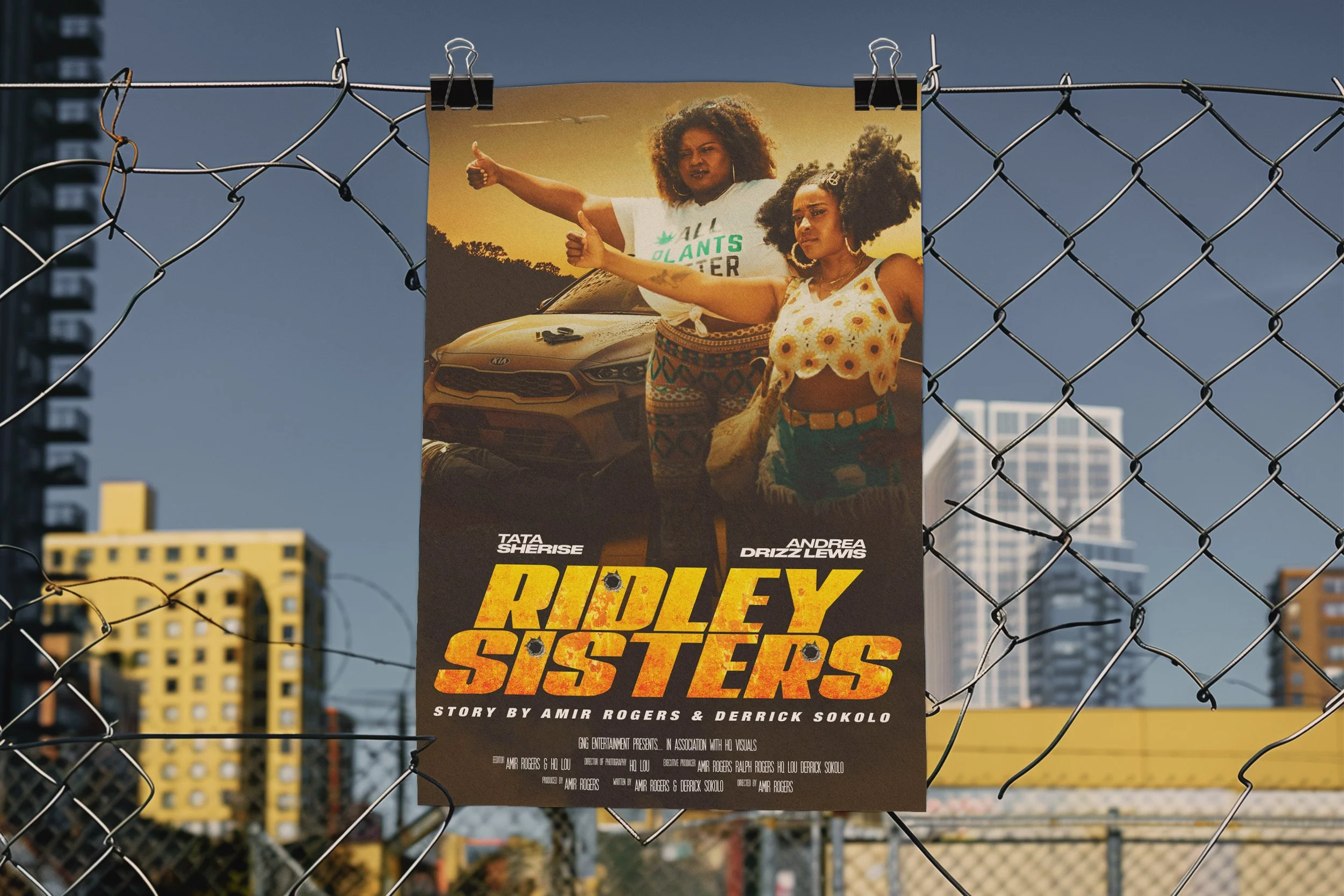
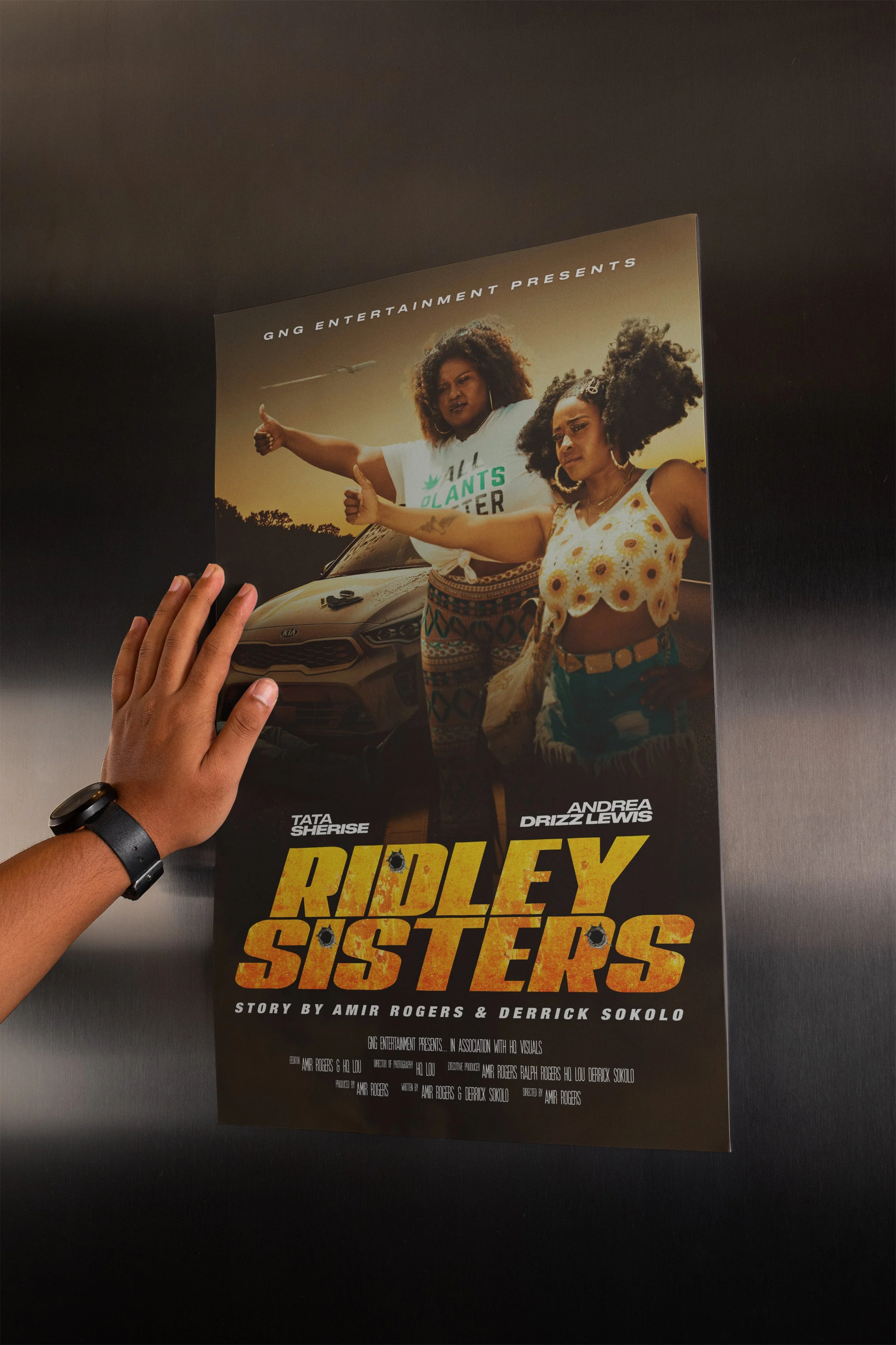
Ridley Sisters is an independent feature film requiring a bold and distinctive theatrical key art direction. The objective was to establish a strong visual identity that balanced cinematic tension with personality, while ensuring clarity and impact across both print and digital platforms.
The design system was built to scale across promotional formats, including posters, thumbnails and digital marketing assets.

RIDLEY SISTERS
Film Identity &
Marketing Visual System
The visual direction emphasises strength and attitude through low-angle composition and cinematic colour grading. A warm, saturated palette reinforces the Southern road-movie atmosphere, while strong contrast ensures the artwork remains legible at distance and thumbnail scale.
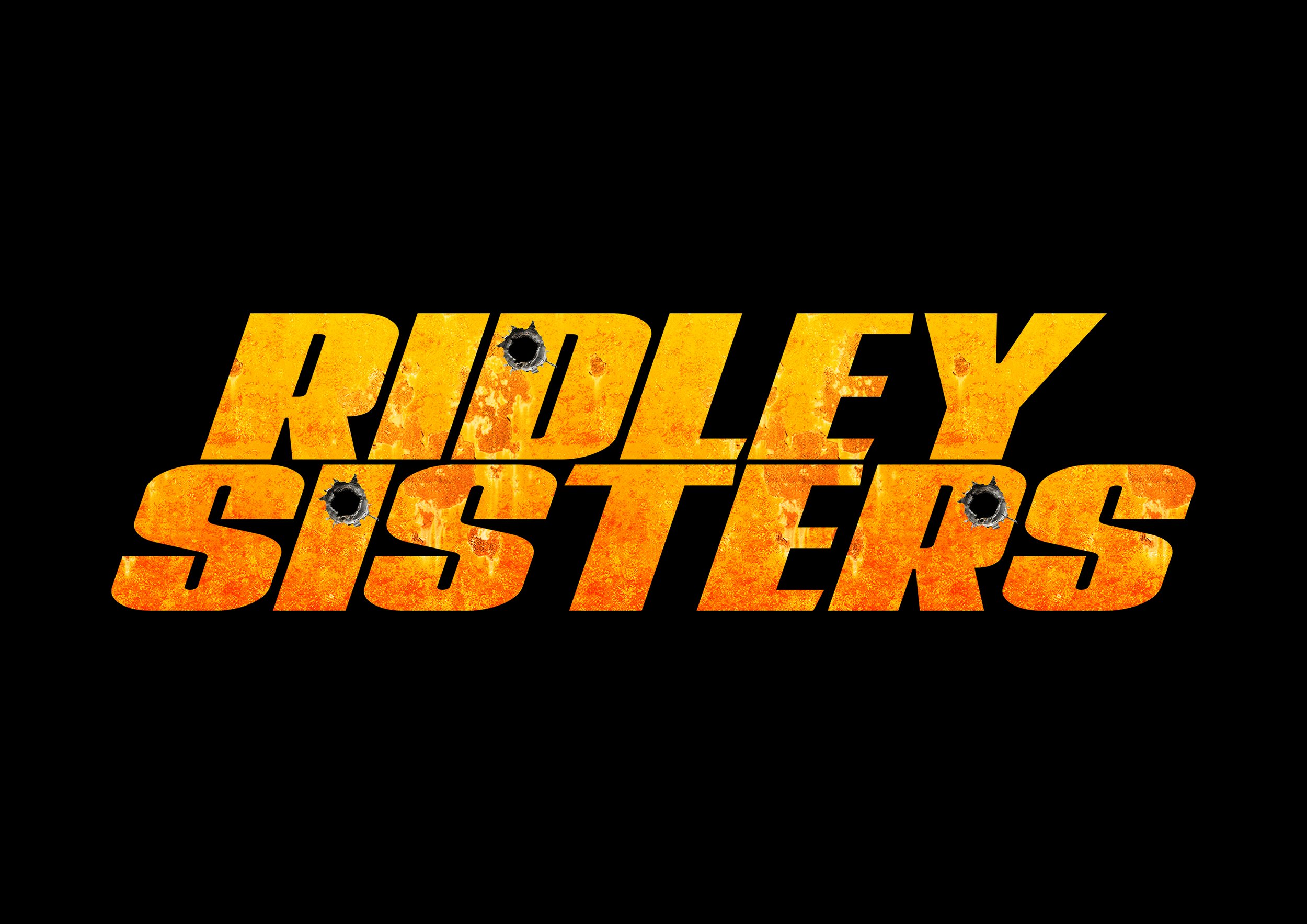
The title typography was developed to feel bold and aggressive, integrating distressed textures and bullet hole motifs to reflect narrative tension without compromising readability.
title card development
The visual direction emphasises strength and attitude through low-angle composition and cinematic colour grading. A warm, saturated palette reinforces the Southern road-movie atmosphere, while strong contrast ensures the artwork remains legible at distance and thumbnail scale.
The title typography was developed to feel bold and aggressive, integrating distressed textures and bullet hole motifs to reflect narrative tension without compromising readability.
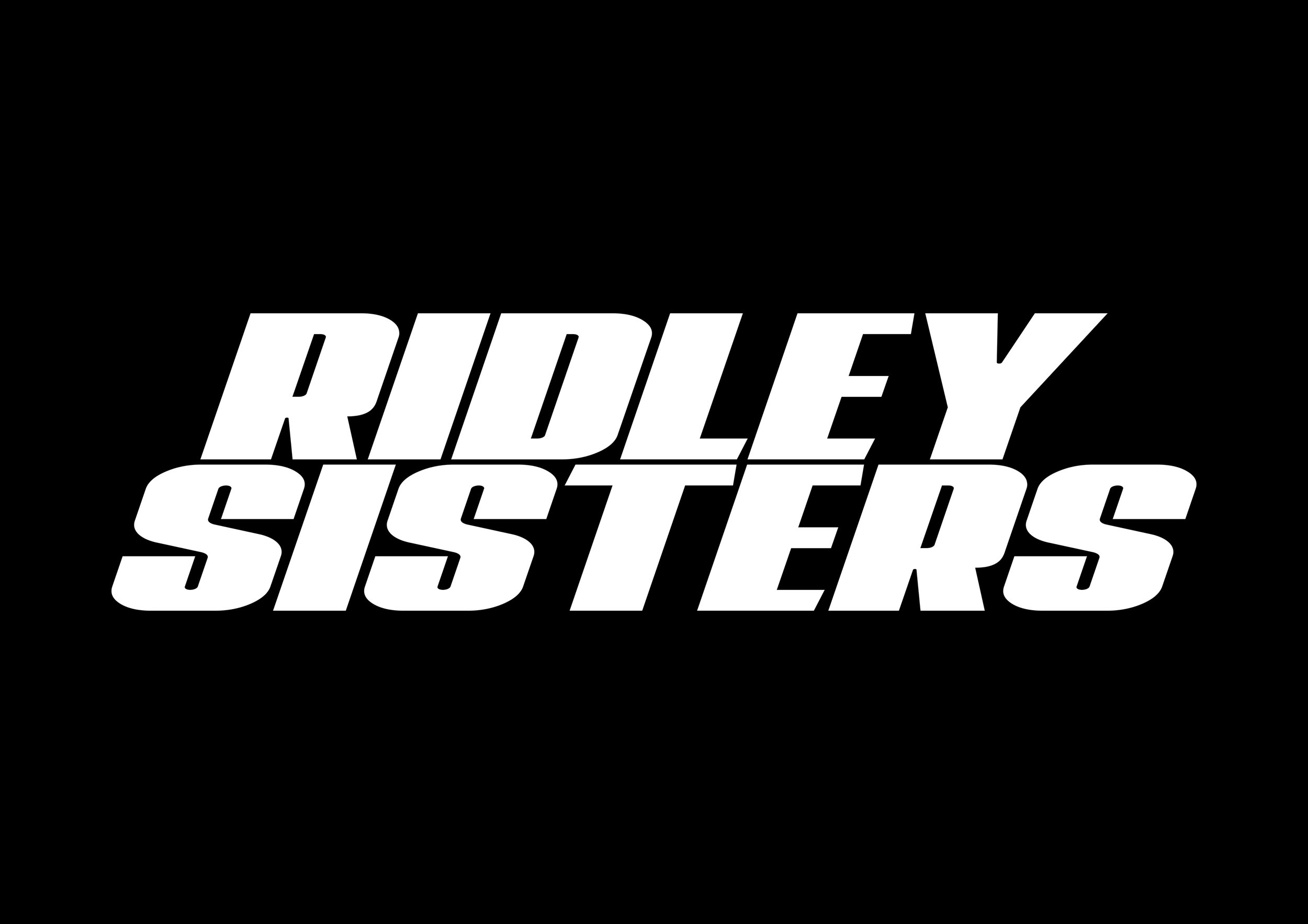
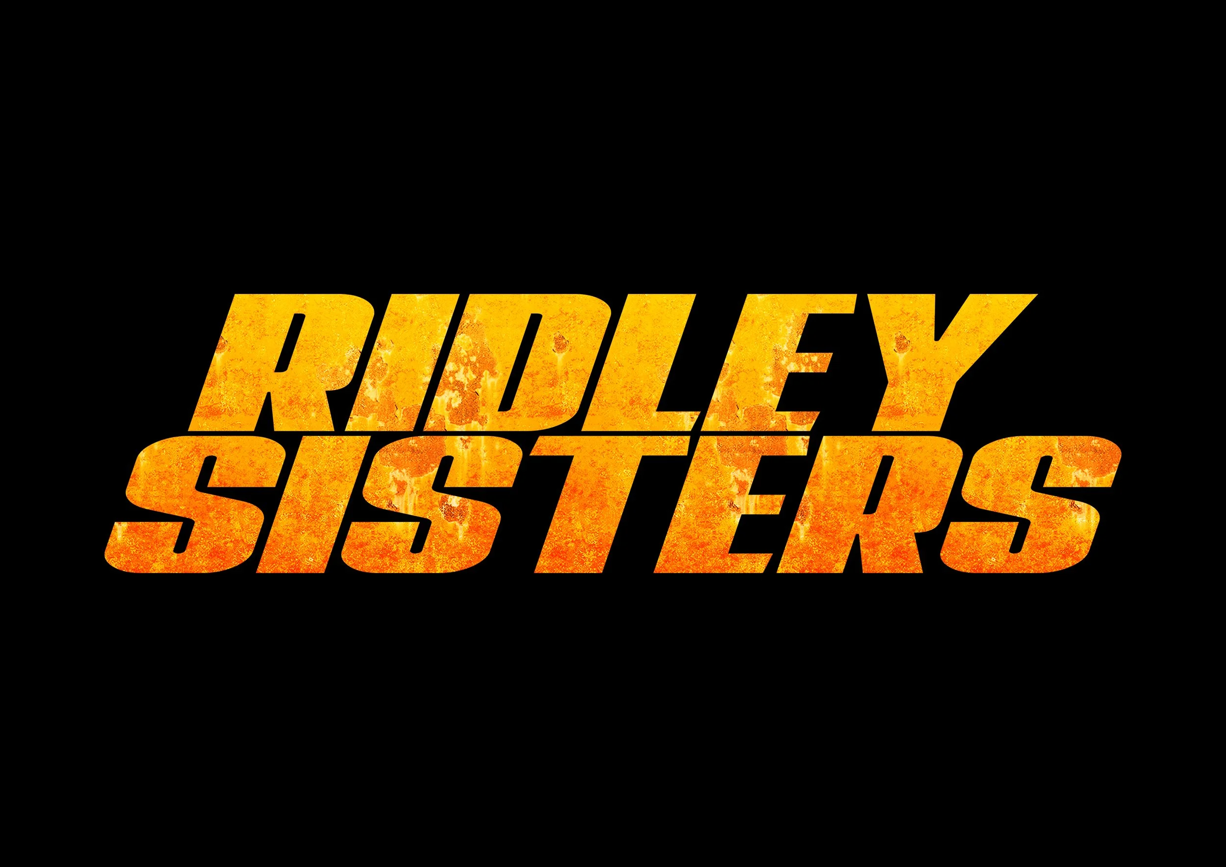
Multiple title treatments were explored to balance impact, legibility and tonal alignment with the film’s narrative. Variations tested weight, texture integration and contrast to ensure scalability across both theatrical print and small-format digital platforms.