
Colorblind — Visual Campaign & Tour Graphics
The visual identity for Colorblind was developed as a high-contrast campaign system built around a restricted monochrome palette with selective red accents. The objective was to create immediate visual tension while maintaining strong recognisability across digital platforms and live performance environments.
The identity was constructed as a scalable framework, functioning consistently across primary artwork, motion visualisers and large-format stage displays.
Concept & Identity Development
The cover artwork for Colorblind was constructed around a restricted monochrome palette with selective red accentuation, creating immediate visual tension and strong thematic contrast.
The red treatment functions as both a symbolic and compositional device, cutting through the grayscale imagery to establish focal hierarchy and reinforce the project’s emotional tone.
Typography was approached as an integrated graphic element, balancing expressive script with structured placement to preserve clarity across digital streaming platforms and promotional formats.

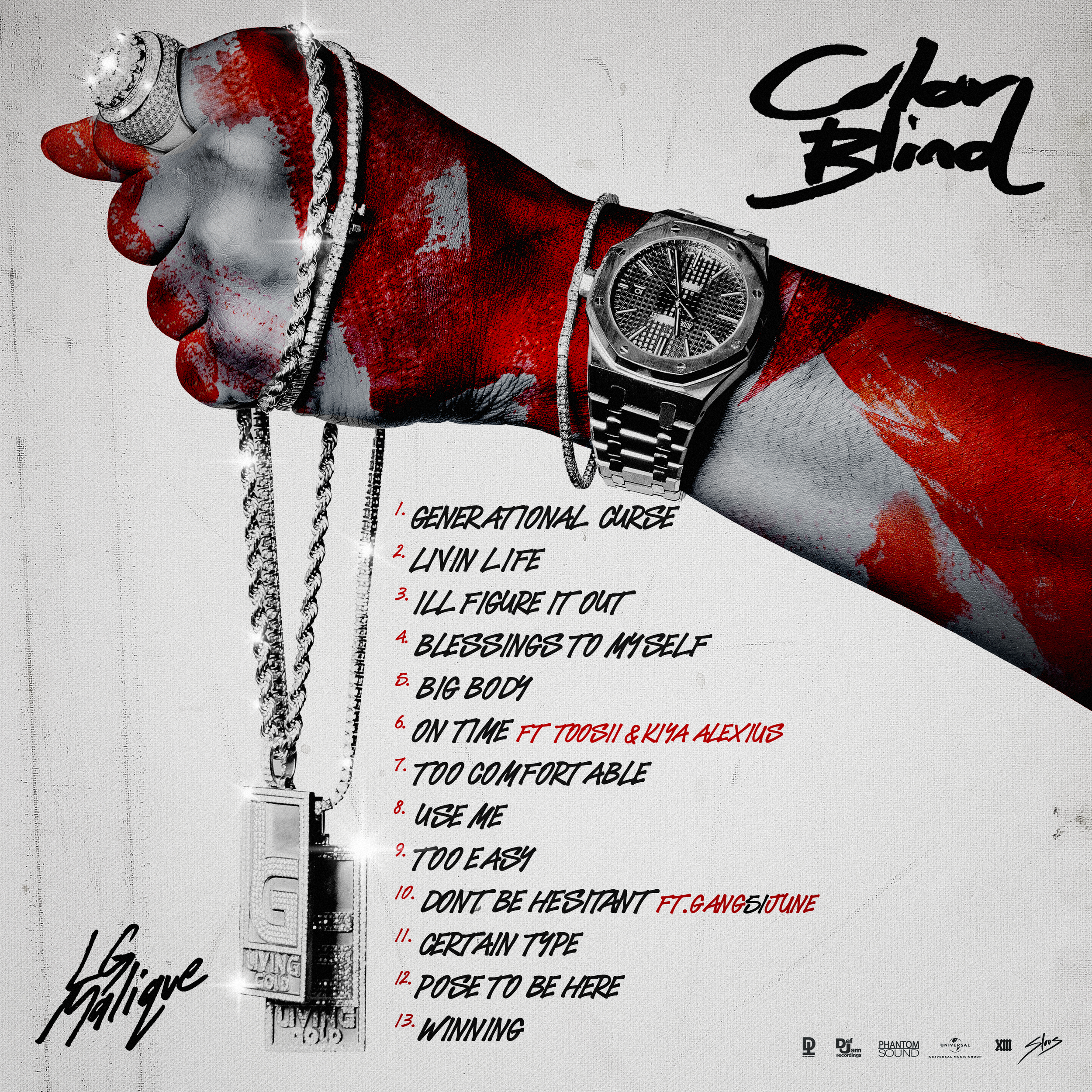
Tracklist & rollout Asset System
The tracklist design extends the campaign’s monochrome and red accent system into a structured typographic composition.
Scale variation and selective colour were used to differentiate track numbers, featured artists and primary titles, creating a clear visual hierarchy while maintaining consistency with the core identity.
Spacing, alignment and contrast were carefully controlled to ensure readability across digital, print-ready and large-format applications.
Motion Extension of Identity
The visual identity was translated into animated streaming visualisers, extending the monochrome and red accent system into motion.
Subtle texture movement, light transitions and controlled pacing were introduced to enhance digital engagement while preserving the campaign’s high-contrast aesthetic.
The animation was designed to complement audio playback without overpowering the central identity elements, ensuring continuity between static artwork and dynamic release assets.
Live Stage performance Application
The campaign identity was adapted for large-scale LED stage environments, extending the monochrome and red accent system into high-visibility performance settings.
Additional motion elements and atmospheric overlays were introduced to enhance depth and energy within live environments while preserving the core visual framework.
Design adjustments were made to account for lighting conditions, viewing distance and screen resolution, ensuring clarity and impact across varying venue sizes.
The result was a cohesive visual system spanning digital release assets and physical performance environments.
Project Information
Client
LG Malique
Label Affiliation
Demon Time Records
Distribution Network
Def Jam Recordings / Universal Music Group
Industry
Entertainment & Media
Project Type
Integrated Visual Campaign
Scope
Visual Identity, Motion Assets & Live Stage Graphics
Role
Art Direction & Design
Year
2023